Oct 21, 2015

Senior Company Artist - Loy Yang Power


Georgie Mattingley, our current artist in residence, came home from a day’s photographic shoot at Loy Yang power station to excitedly tell us that everyone still remembers my time out there as Senior Company Artist – Loy Yang Power, nearly 20 years ago. The memories came flooding back for me, I’ve always seen that period as one of the most influential in my life as an artist.


My 4 assistants Anton Vardy, Chris Roe, Drew Cole & Philip Toth 
paid for by Monash University - photo Angela Lynkushka
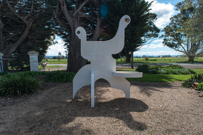
we used some of those cylinders (idlers) for the base of the big public sculpture

It is a grand title, but how it came to be is just as interesting as what we wound up doing with the big Power Co. It all started with Loy Yang Power approaching the head of the art school at Monash University Gippsland Campus in 1995 asking if they could develop a relationship. Put bluntly Monash didn’t really know what a relationship was and assumed that it meant Loy Yang giving the art school money for something like a scholarship and in return the school would badge exhibition catalogues with Loy Yang’s logo. Eventually after both Deputy and Head of school made no progress, the head, possibly in desperation, asked me to try to work out what all this relationship talk was really about.

I soon discovered that both Loy Yang’s CEO, Bob Patterson and head of Corporate Relations and Environment, Richard Elkington were extremely imaginative and creative people who had a vague hunch that artists and possibly their problem solving processes may in some way be harnessed for the company’s good. Over the occasional chat, the odd invitation to an event or informal lunch with Elkington I soon started to realise what all this relationship stuff actually meant, he would describe some of the company’s problems, I’d do the same from an artist’s perspective and we’d both contribute ideas for making things better for each other. Simple really.

Richard Elkington had an idea that I and some of my students could “style” their big Christmas corporate function and as we discussed it further I realised that he was asking us to create an event that expressed the company identity and lurking in this was a genuine belief in being as environmentally responsible as a coal fired power station could ever be, so without either being literal or ramming the message in the faces of their guests we designed the function. First little job a big success, and the students were nearly overwhelmed at being paid properly.


In our workshop - photo Angela Lynkushka

At roughly the same time we suggested that the company apply to the Australia Council for a “partnership” grant, we designed and wrote it around the general idea that the both company and artist would explore the notion that an artist could be very useful to a company and Loy Yang submitted it. The concept of Senior Company Artist – Loy Yang Power was born and coincidentally CEO Patterson during his dinner speech announced its success. He added that he’d been to another function full of major company CEOs a few days earlier, the conversation had got round to “corporate citizenship” and of course he was able to announce that they not only had a Senior Company Artist! but they’d also got a government grant to pay for it; a cause for significant adoration from his peers.

In a way we’d just proved how useful an artist could be, and this was before we’d really started.


Philip and Chris at work

The financial breakdown of the deal deserves a mention, my wages were paid for with the Australia Council grant, topped up to some extent by my main employer, Monash University, and Loy Yang supplied materials, tools, logistics, studio space, engineering, fabrication, documentation etc  which are, in effect, mostly in-kind costs using their own expertise and resources.


Finished major work prior to installation - photo The Visual Resource

The project was to run for 2 years (it actually continued for a further 2 years and during the first we would concentrate on the company’s own identity and its ability to communicate more effectively with all levels of government, whilst the second year was primarily devoted to the Latrobe Valley community.

We kicked–off by suggesting that Loy Yang Power place advertisements in the Saturday art pages of the Age and Australian newspapers thanking the Australia Council for their grant, it turned out, so the council told us, that this was first time that anybody had thanked them publicly, which was a big surprise to us.


The finished major work - Lars Compitalis 
in Victory Park Traralgon 
Loy Yang Power's gift to the La Trobe community
The Visual Resource

Underpinning the whole idea behind the Senior Company Artist model was the belief that pre-20th Century patronage may not have been quite as bad for the artists as we’d led ourselves to believe and that an up-dated version could be very useful in achieving things that many companies found very difficult.


The Federal Minister for the Arts the Hon Peter McGauran 
and Anton Vardy unveil - photo The Visual Resource

The sorts of questions senior management asked me to look at, were, most often, about improving its communication and access to all levels of government, it turned out that a reasonably well known artist could procure a cabinet minister far more easily than a big power company. For one smallish project we got personal signed letters of thanks from both the State Premier and Prime Minister.

The most interesting request came from the CEO who felt that the morale in a certain section could be improved, so he suggested that we move my studio nearer to them, just to see what might happen, again a huge success.

My art was never compromised in any way during the project, in fact I learned that the company had realised that the better I did as an artist the better it would be for them.

The nicest compliment we got was “He’s a lot more useful than a tennis player and a damn sight cheaper” (from a middle level company engineer)


CEO, Mayor, Minister and me (our kids in the background)

Sep 28, 2015

Cowwarr Art Space - from wreck to paradise


Yesterday I took some "spring" pictures of our building 
for the Cowwarr Art Space Newsletter


the grand old dame has come a long way since this


a winter view


a panorama of the gallery interior


the view to the north


the view to the north in winter


the view to the east from just outside my study


the view to the south - from the same place - I love that sculpture


the garden in spring


Sanné Mestrom's Weeping Woman in the garden


Sara Delany - a head of her time, looks towards the weeping woman,
for more about the Cowwarr Art Space click on the link in the links bar.


Sep 5, 2015

A new Australian Flag - September 1995 revisited


click for full size

click for full size - nice words from Betty Churcher, Director of the National Gallery of Australia

Chance had it that I wondered what I was doing 20 years ago, September 1995. No I wasn't designing new Australian flags as the items above may suggest, it was a fortuitous accident. Let me explain - one day back then Rodney Scherer, the director of the Latrobe Regional Gallery, showed me the abandoned theatre in the Old Morwell Town Hall (now the main gallery in the LRG) he was enthusiastic about someone using it for a sculpture installation and that sparked my own imagination and the general concept of the Temple of the Southern Cross  popped into being.

It developed very quickly and was based on the the idea that if Australia had been a different kind of culture we may have imagined that our Gods lived in the stars of the Southern Cross, and, each star contained deities responsible for different aspects of life. The space could be made to look as if devotees of this religious practice had, for some reason or other, abandoned everything in quite a hurry.

But, and there's always a but or two, Rodney Scherer, practical as ever, suddenly realised that we had a small but major problem. How would anyone find the entrance to this place or know that something was going in inside? He suggested that we put something outside on the street, it could have been any old sign but somehow I didn't like that and ferreted about in my mind for something a little more authentic. The idea of a relocatable flag pole and an instantly recognisable flag based on our fantastic night sky was born, of course it had to be called "Night Sky".


There are no good pictures of the flag flying in Morwell but here it is outside the Boisedale Public Hall which makes a nice segue into another historic moment related to the Temple and Night Sky. My memory may not be completely accurate here but I seem to remember Rod Scherer and I were showing the director of the Gippsland Gallery, Michael Young, the abandoned theatre, when he explained that his "new" public gallery was opening in September 1995 and he was on the hunt for suitable art events to use in his opening program. The conversation got around to the idea that nearly every little town has a public hall which could be used for a contemporary installation. Young's favourite was this one and the Temple of the Southern Cross became one of the special events associated with opening of his new gallery. In effect the two regional gallery directors had devised a touring show for me using public halls and abandoned spaces.


Interior of the Boisedale Public Hall hosting the Temple of the Southern Cross

This was opened by the outstanding artist and enthusiastic raconteur, John Wolseley, on 16 September 1995. His highly animated speech contained some very interesting observations concerning the expanded notions of space that he saw in this work. They have influenced me ever since. 


click for full size, image of The Temple of the Southern Cross in the Old Morwell Town Hall

This touring exhibition/installation went on to four more venues, The Nicholson Street Gallery in Bairnsdale, The Cowwarr Art Space and then in September 1997 to the RMIT Gallery and Charles Nodrum Gallery, both in Melbourne.


Night Sky - flying outside the RMIT Gallery, Swanston Street Melbourne


Interior view of the "Temple" RMIT 1997


Aug 21, 2015

Wine Women & Wingadal


What an interesting week: first I receive a copy of this very handsome book, Wingadal The John Symond Collection, written by Elizabeth Hastings, here's my 2002 marble and aluminium work, Art over Modern Art - more over less with a double page spread to itself. It's also fascinating being reminded of comments people have written about you quite some years ago; the text includes this from John McDonald ".... When Murray-White places a large stylised stone head upon a modular aluminium plinth he is telescoping the entire history of sculpture into one simple juxtaposition. In a glance we travel from Mesopotamia to Minimalism." Ah yes - that art over modern Art preoccupation/theme is still there!


Changing the topic completely: This week I also helped my friends out from Narkoojee winery, Val and Harry Friend, by taking a few pictures of their latest stunning offerings, above the medal winning selection, below a collage of the complete set.I can feel a thirst coming on..... right now!


"Aphrodite" shown in the top photo, from last year's Walking Women - Standing Monash exhibition now comes with 2 plinths, one bronze and granite and the other my Alberto Giacometti inspired scaffolding walking person just like the one below. Art over Modern Art alive and well.


Soon all the walking women will have mix and match, two for the price of one, swapable, transformer stands.


Jul 14, 2015

In advance of the broken art


Inside the house I call my mind

there are many rooms and passages I cannot find.


Stripped bare and burrowed deep

I search for things I care to keep.


A spade is a spade, right? But when is a spade not a spade? When it’s a shovel, sure, but we’re here today to acknowledge the 100th anniversary of Marcel Duchamp’s momentous decision to say a spade is spade and a spade is art if he says so. 

At this point I should mention that I have a habit of applying what I think of as a parental test on great moments of art history and although the telephone line hadn’t yet crossed the Atlantic in 1915, let’s imagine a typical Mum rings Son chat. So Lucie Duchamp rings Marcel who’d nicked off from France to America because he found Paris a bit unpleasant during WW1.

Ring ring

Marcel – Hi Mum.

Lucie – Hi Marcel, what’ve have you been up to? Are you looking after yourself properly? It’s pretty tough here, what with the war and all.

Marcel – Doesn’t sound good from what we’re reading in the paper Mum. I’m fine but the real big news is that I may have made a massive breakthrough in my art, I went to the hardware store and saw this shiny American snow shovel, so I bought it, it’s great. I took it home and lent it against my lounge room wall, it’s as good a piece of art that I’ve ever seen. I’m very excited about it. I also invented 2 special new expressions, "anti-art" and "readymade" (art), pretty good eh?

I had a bit of trouble thinking of a title for it, but I remembered your advice about always being careful in the snow in case you fall or slip over and break your arm, so I called it “In advance of the broken arm” in honour of you. 

Lucie – BLOODY HELL MARCEL! Have you gone completely crazy since you’ve been in America, it all sounds too much like, In Advance of My Broken Heart .

Marcel– Don't be like that Mum, the Americans love my stuff, I'm the hottest thing in town.

Lucie - Yeah right, what do the Americans know about art, they're probably just excited because you're French and French is always cool - Have you got a proper job yet? Teaching a few people French seems like an awful waste of your good education.Why don't you become a photographer, they make heaps of money these days, don't tell me you can buy a perfectly normal spade in America and then sell it back to them as art for more money than you paid in the first place, the Yanks must be as mad as you..... you should become a salesman.  

Marcel - I have been playing a fair bit of chess, I enjoy that.

Lucie - I might of thought so, lazy as usual, that's your real problem. 

What do you mean by doing this to your family? 

I know your brothers do some pretty wacky stuff but why do you always try to out-do them? – you used to draw so nicely. Even though you led your sister, Suzanne, astray, she’d never doing anything as nuts as call a spade, Art


The war’s bad enough but having a son like you will be the death of me. Promise me you’ll get some counselling as soon as possible. I’ll get your brother Jacques (Villon) to give you a call tomorrow, I know you’ve always respected him; maybe he can talk some sense into you. Good bye, I’m too distressed to talk anymore……..I think I'd better talk to your father about inheritance.

Fast forward 100 years and of course we can notice that we tend to keep the bits of the Duchamp story that suit us and loose the others in bottom of our odds and sods draws.  

For me there has always been a bit of a conundrum surrounding the location of “art” or “anti-art” in the readymade snow shovel sculpture. Duchamp selects an artless object (no art or anti-art) and claims some authorship (dubious), places it so that it is ready for its intended use of controlling nature (heaps of inconvenient snow) and then lets everybody imagine the climatic circumstance that may require its use (much art/life imagined in the mind of the viewers). So in reality the snow shovel is just a triggering device for a kind of art that exists only in the mind, which is, coincidentally, an accurate definition of a completely abstract art.

It has been persistently claimed that a major motivating force behind the rapid changes in art between late 19th and the early 20th centuries was the invention of photography or more particularly cameras. Indeed a machine that could create a reasonable facsimile of art or convert anything into instant readymade art must have been quite terrifying and undermining. Artists of the time had every reason to see photography as anti-art. Although Duchamp’s readymades are not quite in same league as the invention of photography both contributed immensely to the ever expanding idea that anything and everything could be art and anyone could be an artist or Art is everything – Nature is Art - Craft is art etc etc.

Bunnings or the Bush?

Bunnings was the very obvious choice for a readymade sculpture gallery commemorating 100 years of Duchamp with a readymade retrospective. There are, however, many present day impediments that should really be considered. Most notably that Bunnings has so many artless objects which means they often cancel each other out. Sadly these are curated in a very conventional way and ordered into categories replicating the attitudes of the traditional 19th century museum. And worst of all Bunnings is an icon of the Anthropocene.

That said, no art is far worse than some art, so regular trips to any of the many convenient Bunnings stores may just about service that need for art. And of course there’s something for everybody, kids included.


The scrubby bush seemed a much more sophisticated and appropriate choice for a Duchamp inspired readymade outdoor sculpture venue, but it too comes with a few minor problems. Comprehending these Australian landscapes has always been a persistent problem for many people, who tend to see them as a characterless mess, devoid of worth and inhabited by all kinds of nasties.


Fortunately by 1915 a few painters from the Heidelberg School had made a good start at making convincing representations of this most Australian of art problems. Frederick McCubbin 1855 - 1917, effectively interpreted this kind of bush in pictures such as "Violet and Gold" 1911, the "Pioneer" 1904 and "Lost" 1886. In terms of chronology, a direct Australian comparison with Duchamp 1887 - 1968, must be Hans Heysen 1877 - 1968, with works like "Sunshine and Shadow" 1904 that by now depicted the close bush devoid of humans or farm animals.

The site for this commemorative work is an area of bush bounded by the Tinamba-Glemaggie and Weir Roads, just north of Heyfield. There is convenient parking at the corner where these roads meet. It is available for viewing all year round though it is advisable to use insect repellent in the warmer months and take notice of local bushfire fire alerts.


It is recommended that visitors walk into the bush to a point where roads or buildings cannot be seen, then stand still and just look. Soon, instead of seeing a mess, millions of intriguing details will start to pop out of nowhere. You should look at one as long as it interests you or your eye is attracted to another. Sadly it is a little easy to get side tracked by evidence that other humans have visited this place and have abandoned items here. Most seem to have been purchased at Dan Murphy's or possibly Bunnings. Whilst these objects definitely refer to Duchamp's readymades, the delights and layers of experience offered by the natural version is infinitely more rewarding.

The special character of this place is largely due to fire, it has probably burnt regularly since it first took root. As each fire has gone through, saplings bend as they are burnt, in keeping with the wind direction, leaving not only evidence of the process but an example of nature's own fabulous art skills. Some trees fall over and re-compose their broken parts on the ground or get hung up in other trees.


When approaching this genuinely site specific work it does help if you know quite a bit about art, because here, it definitely is the case that the more you know the more you'll find. This complex show makes Nicolas Bourriaud’s, "Art in the Age of the Anthropocene" at the 2014 Taipei Biennial look clumsy, naive and a cynical avoidance of truth.

Lovers of sculpture should go looking for Henry Moore's truth to material theory, you'll see nature's made a few Giacometti's of its own, there are many examples of the David Smith/Anthony Caro accumulations of readymade parts arranged according to the cause and effect, syntactical relationship concept and Eva Hesse lurks everywhere. It is not hard to notice that nature has avoided the quasi-medievalism of Goldsworthy. Minimalism is well represented, though the earthworks of Smithson and Heiser are purposely avoided by nature as being a particularly human imposition on landscape.

Better use of space, more sophisticated manifestations of kinetic movement, perpetual change and greater variety of form, tone, colour, light, line, edge and texture in this place challenge the combined best efforts of human artists.


One cannot help but observe that art and the planet could be in better shape if Marcel Duchamp had chosen a readymade landscape instead of a tool used by humans to shape it according to their own selfish interests.

Note: Bunnings is a chain of warehouse sized hardware stores, Dan Murphy's is a chain of liquor stores.

.

Apr 6, 2015

The National Science Museum - Melbourne Landmark & City Square


The office disaster has had a few benefits - it encouraged/forced me to sort through my papers, photos and sketch books.......and.......prompted this post about unrealised projects.

My favourite is pictured above, and is taken from a sketch book. In second half of 1987 I was asked to come up with a concept design for a sculpture for The National Science Museum (Canberra), my notes remind me that I referred to science by having four different sections in the work. A traditional central column made from or covered with metals that corroded or oxidised, copper, brass, zinc and silver (plated); it aimed to show the effects of phenomena on elements. A triangular stainless steel support was supposed to be a metaphor for the human aim for perfection. Another support was designed to be "living" and was covered with a hardy creeper and the crowing glory was to be a massive prism, 2.5M long by 1M high that would break light into its spectrum and bathe the museum forecourt and visitors with rainbow colours. I even thought that it may be possible to create a "coloured" sun dial by placing little frosted glass makers strategically in the paving that lit up when struck by the prism colours. The sculpural work would have been H 4M x W 5.3M x D2.5M.

But there was more......I'd noticed that, when I drove over my garden hose, water would squirt out, nothing revolutionary about that but it prompted the idea to have a series of "speed humps"on a nearby road that pumped water whenever vehicles drove over them - so in effect the waste energy of traffic kept the living column alive - an idea I liked a lot.

So why didn't it ever get made? The answer is simple - it was ferociously expensive, just the prism on its own would have cost over $250,000 back then!

Well if we're talking unlimited amounts of money this next bunch of drawings surely take the cake.


In 1978 there was The Melbourne Landmark Ideas Competition, I know I thought about it quite a bit but can't find any record of me having actually submitting a contribution, but finding the old drawings has been quite entertaining, especially given the way architecture has changed since then! The site was roughly where Federation Square is now. My approach was to imagine my sculptures of the time converted to a truly architectural scale. The one pictured here would have been a solid lump of mild steel transformed by an irregular oxy-acetylene cut, the original would have been no bigger than 400mm in its largest dimension.


One of my big leggy steel sculptures from the 70s re-imagined at almost skyscraper scale.


This last one was actually quite practical. In 1976 the young and new firm of Denton Corker Marshall (DCM) won the Melbourne City Square Competition, in December 1977 DCM invited Ron Robertson-Swann (the commission winner with Vault aka Yellow Peril), David Wilson and me to submit designs for the City Square sculpture, my contribution Port shown above. Our brief was fairly aggressive in that the key criteria was that it should compete with both the Town Hall (shown in background) and the nearby cathedral in either scale, colour or both, which is exactly what Robertson-Swann's work did.

The repercussions of the City Square commission had a profound effect on both my own sculpture and the way I approached large projects, as the ideas in the National Science Museum concept quite clearly show.

Mar 6, 2015

Mildura 1 - McClelland 0

      
Mildura 1 - McClelland 0


Kevin Mortensen: Objects in a landscape (detail). 1973
Mildura Sculpturescape 1973 - best in exhibtion
Image from Sculpturescape catalogue no credit provided, possibly Ken Scarlett


I became frustrated while comparing individual works shown in Mildura revisited: sculptures exhibited 1961-1978 5 September 2014 - 26 Jan 2015 Curator:  Ken Scarlett, Mildura Arts Centre and the 2014 McClelland Sculpture Survey and Award 23 Nov – 19 July 2015 Curator: Robert Lindsay, McClelland Gallery and Sculpture Park. It was always going to be an unfair competition and Mildura revisited was so far ahead that it seemed appropriate to steer this short piece in another direction.

There can be no doubting that the Mildura Triennials were the great innovator of Australian open air sculpture displays, some 40 to 50 years ago, and the current McClelland version is but a pale, safe, bourgeois and sanitised example by comparison. The core difference is the strategies of the curators, Mildura’s Tom McCullough believed firmly in consulting with every branch of Australian sculpture and, in effect, devolving and democratising the selection process to the artists themselves. It was risky but also guaranteed that almost every significant Australian sculptor of the time enthusiastically participated in his shows. He had been well advised that winner take all competitions were demeaning and instead used his modest budget to acquire significant works or reward the better temporary works, resulting in an Australian sculpture collection that is almost second to none.

McClelland’s Award is acquisitive which really means that winning works cost the gallery substantially more than their actual worth. Lindsay also has an unfortunate mock collecting policy which allows past triennial participants to leave their work behind on permanent display thus confusing any notion of a curated collection.  He regularly accepts gifts of out of context works that were commissioned for other sites; this also devalues the few fine works that they have actually acquired.

Included in the opening events for Mildura revisited was an “In Conversation” session involving a group of the original, now old artists, these included Domenico de Clario who gleefully reminded us that theory based art practice had won the great battle in Australian sculpture that was slugged on the banks of the Murray so long ago. 

He treated the audience to a fine example of the theorist’s fundamental technique, borrowed in this case from the architectural profession, who, to convince clients to let them build impractical art galleries, disparage ideas of flexible/art friendly display spaces by repeatedly using the expression “White Cube” as if it is completely evil and devoid of any merit at all. De Clario deftly steered all who were listening towards the proposal that “site specific” was good and “white cube” was bad.

Since site has always had a crucial and dominating bearing on how any sculpture may best communicate its message it seems worthwhile to look more carefully at the display philosophies of both Mildura revisited and McClelland.

In 1973 Tom McCullough wrote in his introduction to the catalogue of Sculpturescape, an 8 hectare site between Mildura Arts Centre and the Murray River, “It has been a major experiment for a public Art Gallery to move a serious, selective exhibition away from a museum bound atmosphere as much as possible” ….and always honest, he included, “Of course, not all sculptors were interested in showing their works in a landscape of any shape or form. One artist wrote in declining our invitation, “a landscape is Sculptural, it does not need sculpture.”

McCullough’s landscape was in fact a ratty and confronting swathe of uncared for land that had previously been used as a Mildura tip. This did not seem to deter the artists, liberated, as they thought, from the stereotypical “White Cube” gallery.

Almost all of these artists failed to comprehend the powerful narratives of this tatty ex-tip scrub. And the more they scratched holes, scattered their rubbish, dumped large objects on it, bandaged trees or planted gardens, the more they vandalised this struggling landscape (beautifully shown in a remarkable B&W ABC Mildura Sculpturescape documentary that played constantly in the gallery foyer). Overtaken, as they were, by the sheer newness of this exhibiting experience nobody seemed to notice that works that claimed to be site specific were instantly compromised by being in close proximity to any number of other works and the site became general rather than specific. The old tip just swallowed up the art and made it all look like random rubbish; proving that, at least, this landscape did not need sculpture.

McClelland now displays its prize entirely in its own bush land which, in its own way, is just as strange as Mildura’s. It is a patch of dense, scrubby urban landscape surrounded by suburbs and is the kind of area where irresponsible people would illegally dump rubbish and unwanted vehicles. Robert Lindsay’s approach is to hack ersatz “white cube” display rooms in the bush and connect them with a path. His exhibitions force all works to be viewed passively from his ugly pathway that uses tan bark/woodchips as surface. Narratively speaking it is a gross insult to a forest to grind up its relatives for people to trample, dumped as they are, in full view of the living generation.

Given that most of the works included in the McClelland exhibitions would be more at home in a genuinely urban environment and rarely attempt to comprehend the McClelland context, the result is weird to say the least. There is always a preponderance of slick architectural jewelry and works that depict cute animals, vehicles and small buildings, these always swamp the hand full of genuinely engaging sculptures.

At the heart of both exhibitions, though separated by considerable time, is a human arrogance that interprets landscape as a resource that can be exploited by dumping art on it. The idea that we can change a place from ex-tip to sculpture park simply by saying the words and erecting a cheap fence, defies reason. It is this self-interested and convenient re-zoning that always causes the greatest number of problems. It is hard to fathom Lindsay’s logic for fencing his event off from the McClelland Sculpture Park especially when it wreaks “arbeit macht frei”.

Undeterred by this, artists throughout Australia, since the Mildura days, have repeated the same fundamental mistake by enthusiastically lobbying the controllers of any area of land for its use as sculpture, or “public art” display.

With Lindsay announcing his retirement it may be an appropriate time to encourage his successor to completely rethink the McClelland Award, bring it up to date, make it relevant and attempt to solve the complex range of issues involved with displaying sculpture in a variety of “landscapes”.

The first little task should be to correct the McClelland's title by making it either a survey or an award because it cannot be both unless it becomes a well curated invitational event.

Lindsay’s style of convenience out-door curating relies on ignoring many of the issues that affect both site and the sculptures displayed in it; this is in marked contrast to the way art is displayed inside the gallery where every minute detail is attended to.

We do not need concepts of the anthropocene, object oriented ontology and imagined realities to guide us towards identifying McClelland’s shortcomings as there are far more reliable approaches. A casual viewing of any of Monty Don’s great garden TV shows or even an evening at home with Grand Designs could be enough to set the new curators off on the right foot.

In trying to name the narratives of McClelland’s outdoor spaces I found myself wondering what this place could be if it was not an art gallery. Golf course came to mind, and so did reception centre, but neither of those took into account the current treatment of the landscape so I settled on a coastal camping ground with a better than normal office and shop.

These holiday sites are the only other example where gloomy living spaces are hacked into this kind of bush, open areas are minimally maintained and, for the short period of time when they are used, are littered with cars, boats, and other items of Bogan bling.

The 1970’s Mildura Sculpturescape style of open air sculpture display, still practiced by McClelland, has surely had its day. It must be time to start looking for models that offer both sculptor and viewer a much more rewarding contemporary experience that sets an example in terms of sustainability and allows each artistic proposition to be expressed according the artist’s own intentions. Doubtless many participants in these exhibitions have felt that their work has been most compromised by the very unsatisfactory way that it is obliged to connect with the ground. This is via the compulsory attachment of a brutally ugly concrete slab, surrounded by the outdoor equivalent of a muesli coloured shag pile carpet.


Matthew Harding: Void. 2014 McClelland Award winner.
Hacked bush, mock muesli shagpile and bling
image from Mclelland catalogue Mark Ashkanasy

40+ years ago Mildura was envied by sculptors throughout the world, McClelland claims “World Class” but cannot substantiate it, because to put things into very sharp focus, just 11.4 kilometres down the road is a garden park that was voted  ‘Landscape of the Year’ at the 2013 prestigious World Architecture Festival Awards (AKA Olympics of Architecture). The Australian Garden at the Royal Botanic Gardens Cranbourne, designed by Taylor Cullity Lethlean (TCL) and Paul Thompson, sets an example that the McClelland Sculpture Park must heed if it is to survive.

Lindsay’s current DIY approach should cease.

It’s time to call in the experts: the Landscape Architects.

Write a good brief that aims to convert McClelland into a genuine and effective “Sculpturescape”.

Have a well-advertised landscape design competition.

Win a few awards and all will be well again.